55 Restaurant Marketing Tips To Win Your Market
Discover the best restaurant marketing tips and learn how you can harness onlin...

Building a great online presence is essential to the success of your restaurant. A well-designed restaurant website is the cornerstone of this online presence and can serve to both attract new customers and build loyalty in existing customers. That’s the holy grail of restaurant marketing. But how do you create an inspiring restaurant website? What should you include and what should you leave out?
There are so many options for website creation these days that it can seem like an overwhelming, difficult, and time-consuming task. But you don’t have to reinvent the wheel.
Instead, why not get inspiration from businesses that are already doing it right? We’ve put together a list of restaurant websites, and the specific features they do well, so that you can generate ideas for your own online presence.
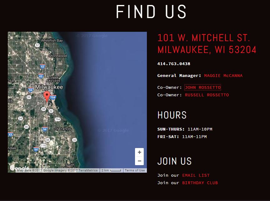
Transfer Pizzeria Cafe’s simple yet effective website packs all the necessary information onto a single page…all without looking cluttered or feeling crowded. It also does a great job making sure you can find their location.
The addition of an on-page Google map means even visitors to the city will be able to sample Transfer’s tasty menu.
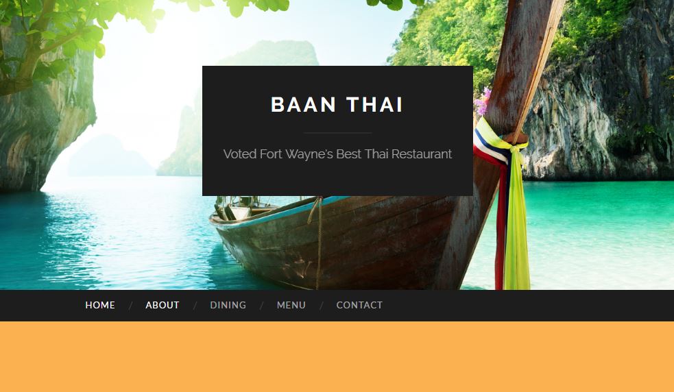
The Baan Thai restaurant in Fort Wayne, Indiana makes great use of high-resolution pictures to draw in website visitors. Color abounds wherever you look and the vivid representations of the Thai region make you feel like you’re already there.
Don’t settle for washed-out, blurry photos on your website. If need be, hire a professional photographer or purchase high-res photos online to give your website the extra kick it needs.
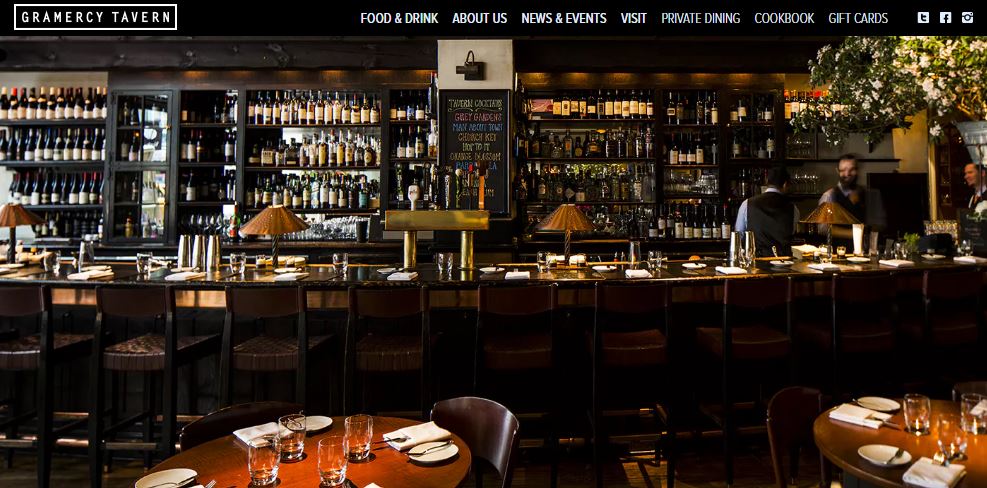
They say a picture is worth a thousand words. And what better way to greet website visitors than with a warm and inviting image that communicates the story of your business. Case in point, Gramercy Tavern.
The opening image that greets website visitors is just begging to be studied. Better yet, it makes you want to visit their restaurant to see this beautiful bar in person. If your restaurant has a unique feature, highlight it in a prominent position on your webpage.
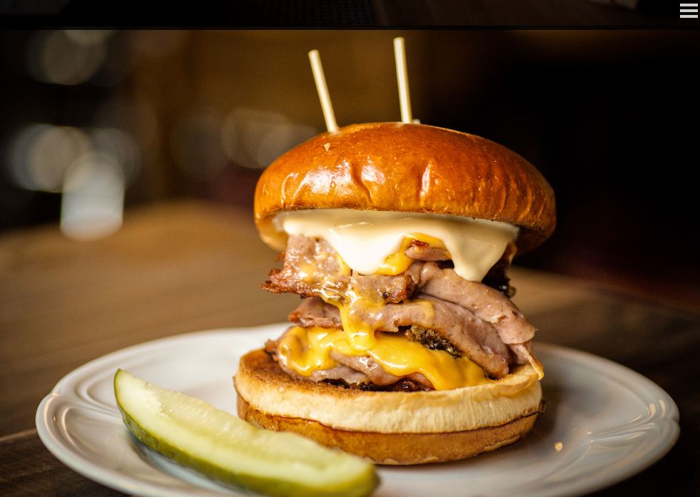
AuCheval in Chicago, Illinois does a wonderful job of making their website all about the food and atmosphere. Notice anything about the website image above? There’s no text.
The entire page is given over to images of the delicious food AuCheval serves. All of the navigation tools are packed away in the menu at the top right of the screen.
AuCheval understands that all the text in the world won’t drive hungry customers through the door like mouth-watering pictures will.
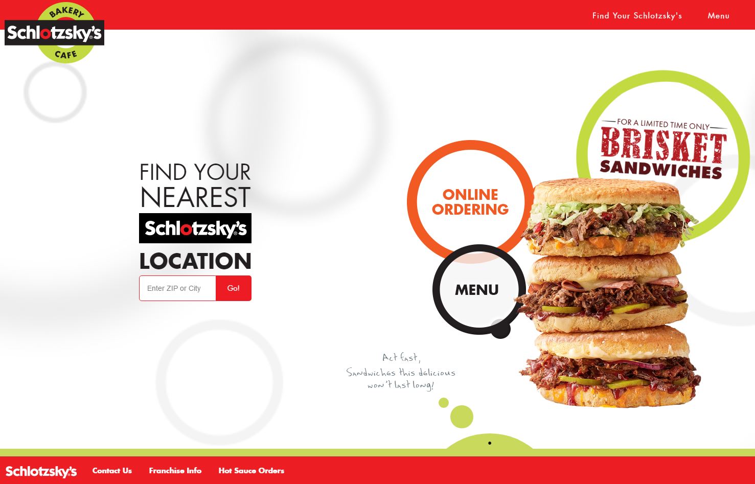
Color affects the overall message your restaurant and your website convey to potential customers. Color choices like browns and grays can beckon customers to sit and stay for a while, while bright colors motivate visitors to eat and be on their way.
The Schlotzsky’s website pairs stimulating hues of red and green to stimulate appetite and motivate visitors into action (“Yes, you’re hungry. Get off your butt and come have a sandwich!”).
Do some research into color combinations for restaurants and choose a palette that communicates your business’s message.
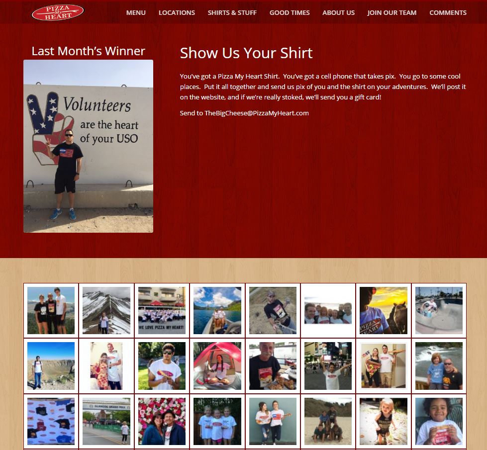
There’s nothing like showcasing people who love your food. Pizza My Heart does this in spades by offering patrons and website visitors the opportunity to get involved.
Simply purchase a Pizza My Heart t-shirt, snap a pic of someone wearing it (preferably in some exotic locale), post it online, and you could win a gift card.
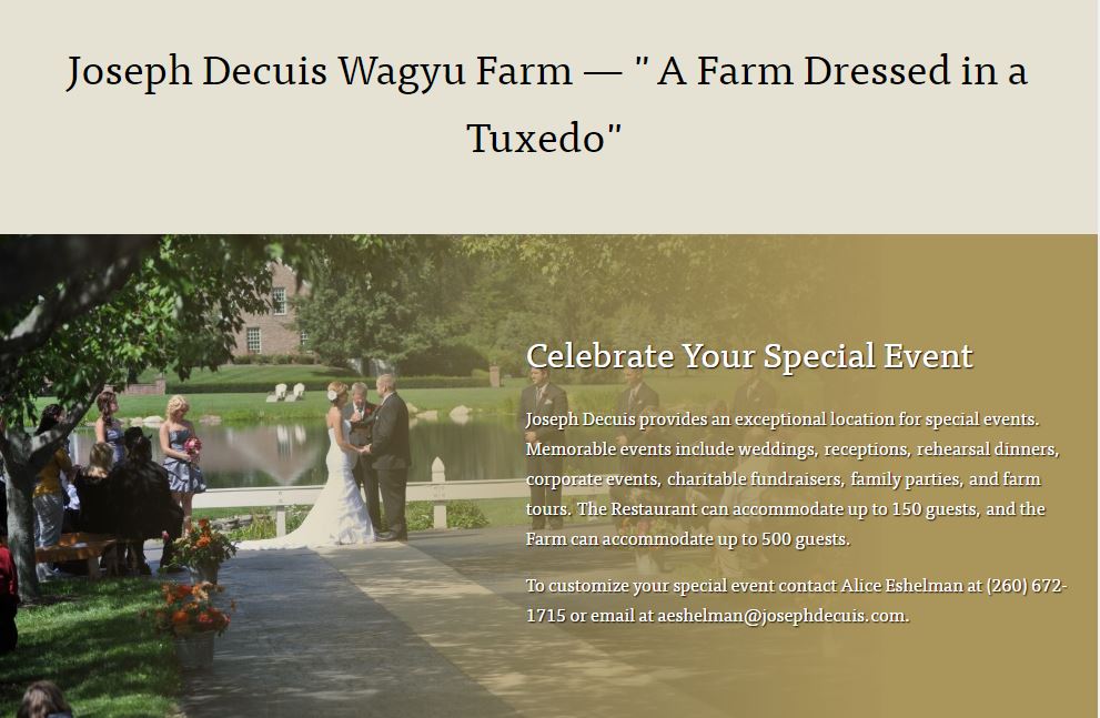
Helping people think outside the box is always a good thing to do on your website. The Joseph Decuis website reminds visitors that a special event is more memorable when celebrated in an exceptional location.
If your restaurant can handle it, mention that special events are welcome and tell website visitors how you can make that event the best it can be.
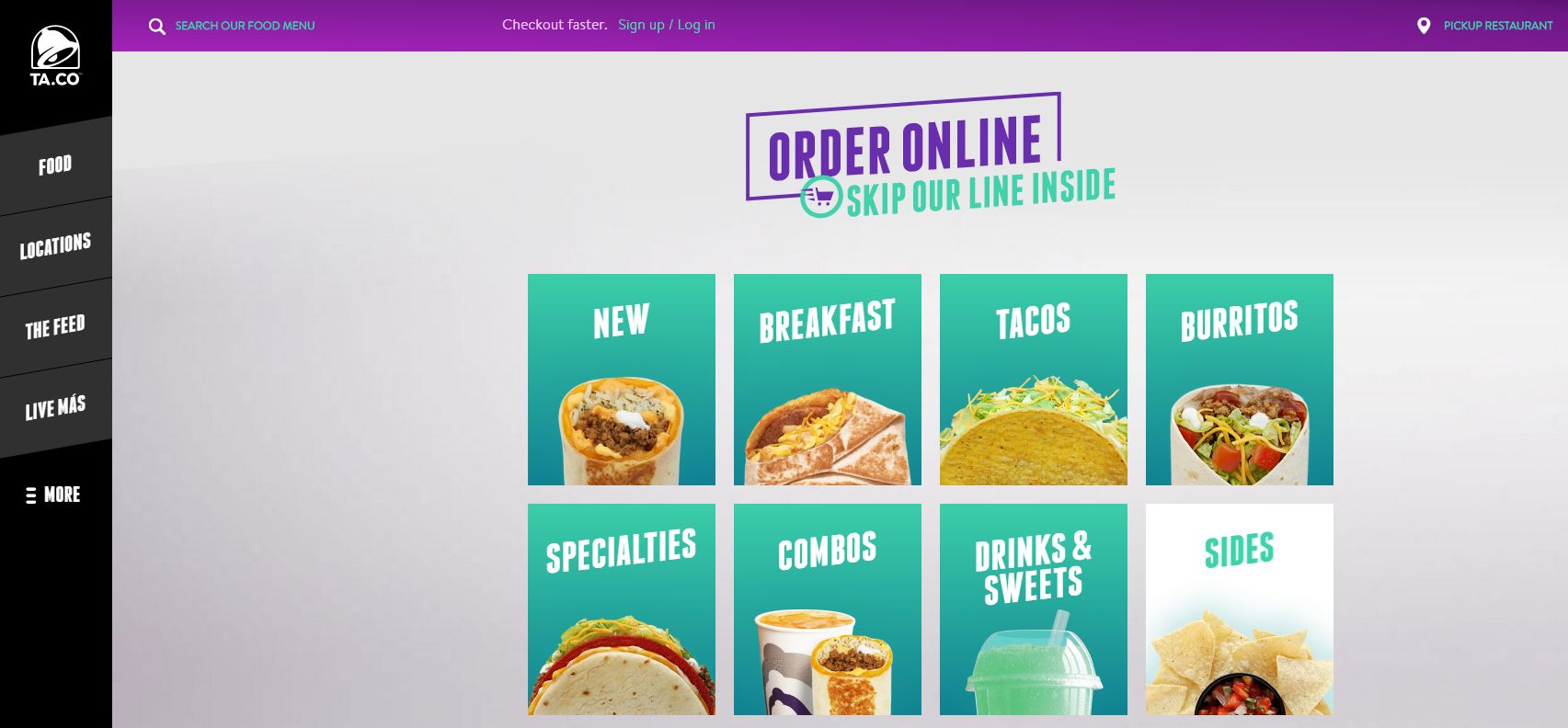
Convenience is key these days, and nothing makes fast food faster than ordering it online. Taco Bell showcases this handy option at the very top of its website.
Customers only need to find a Taco Bell on their mobile device, place an order online, and stop long enough to pay. For people with busy, on-the-go lives, this is nothing short of a godsend.
If your restaurant can handle online ordering, consider featuring it prominently on your website.
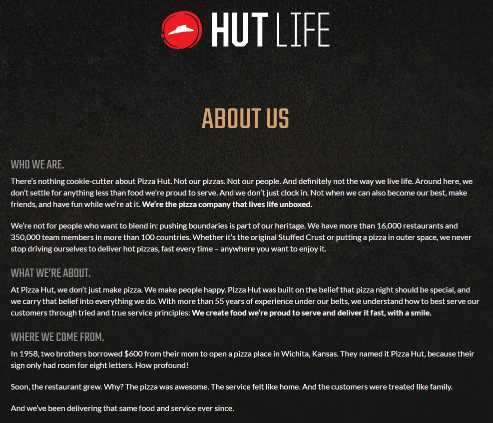
People love a good origin story…especially when it comes to restaurants. What drove this business into existence? What put the restaurant on the map?
A good origin story gives personality and flavor (no pun intended) to the food your customers love. International chain Pizza Hut does a nice job of telling visitors how they got started and why their business is called Pizza Hut (the sign only had room for eight letters).
It’s little details like these that add character to a restaurant and make it feel like a member of the family rather than an impersonal business out for nothing but your money.
If you have a compelling origin story, or even if you don’t, add an about link to your website to draw customers in.
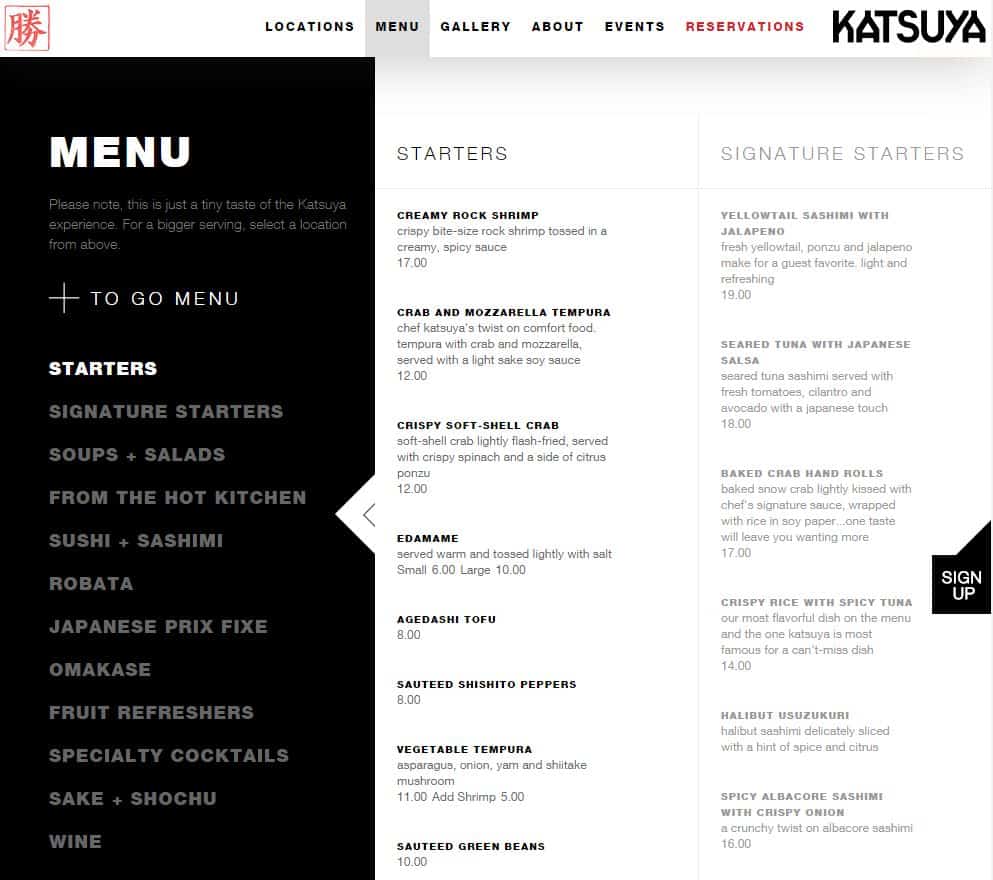
The restaurant business is all about good food. A website without at least a small description of the restaurant’s fare is like peanut butter without jelly or Mickey without Minnie.
Katsuya takes this to heart and makes sure to list as much of their food as possible. We also appreciate the note at the upper left (under the word “Menu”) that “this is just a tiny taste of the Katsuya experience.” It lets visitors know that there’s more in store for them when they visit the physical location.
Consider highlighting at least a few of your signature dishes in a prominent position on your website.
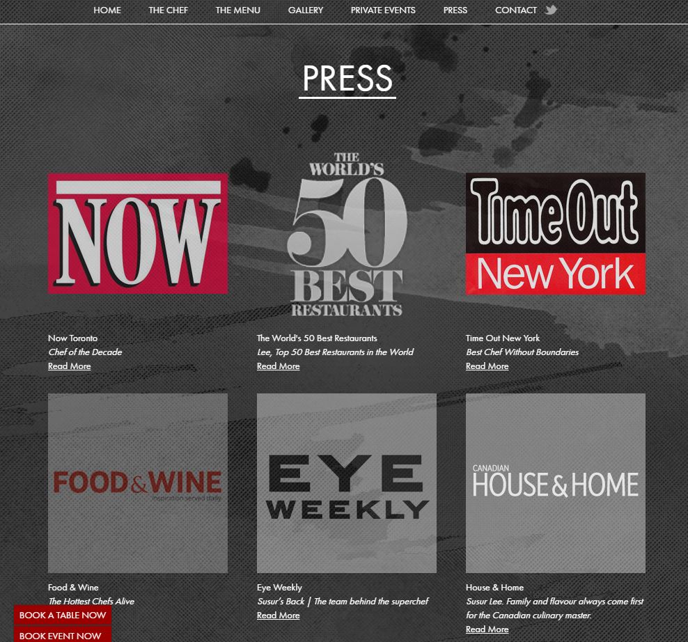
Good press is a powerful motivator in the restaurant industry. It tells potential customers that other people — and enough of them — like your fare to the point that you deserve a write-up.
The restaurant dubbed simply Lee does a nice job of highlighting the positive press it has received. The website uses large, eye-catching images of the publications in which it was featured to show visitors that this might just be someplace worth visiting.
Even one piece of glowing press can be enough to drive customers through the door. So be sure to mention at least one or two great reviews somewhere on your website.
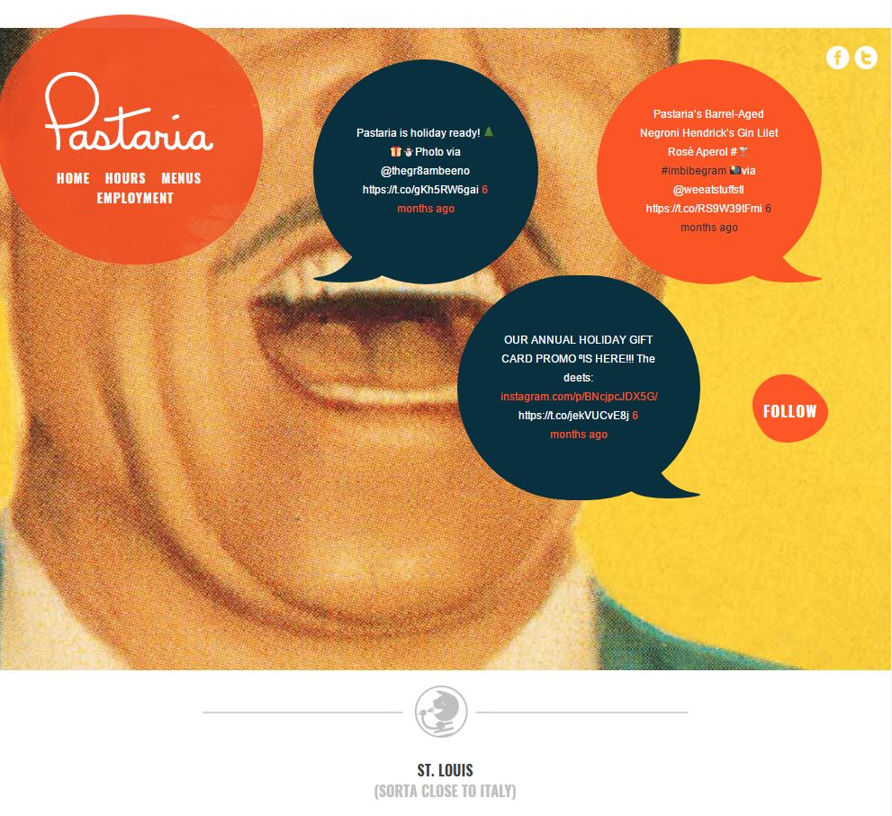
Got a special event like a wine tasting or a holiday bash planned for your restaurant? Feature it in an announcements section to drive interest.
Pastaria makes nice work of their announcements section with an interesting background and presentation. It’s a fun and eye-catching way to present information that might otherwise be skipped by hurried website visitors.
Get creative with your announcements section (a scrolling marquee at the bottom or a prominently placed link?) so that customers are compelled to stop and read.
The more creative you can be, the more memorable your announcements will be. That translates to increased attendance, word-of-mouth, and eventual event success.
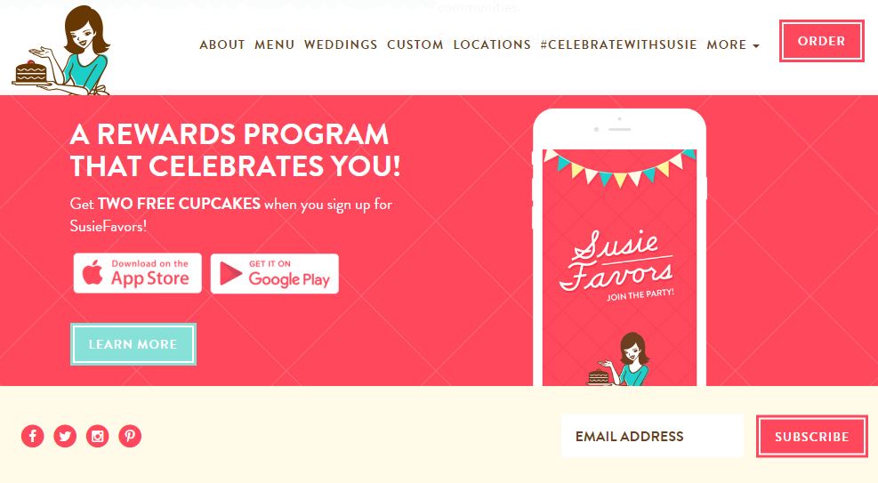
People love to get stuff for free, so restaurant rewards programs are a great way to drive customer loyalty. Susie Cakes bakery does a fine job of highlighting their rewards program and making it easy to sign up. Plus, you get a reward just for signing up. Clever!
If you don’t already have a rewards program, consider creating one to drive return visits. The apps used to make these rewards programs a reality are pennies on the dollar compared to the returns you can get from bringing people back through the door over and over again.
If you institute a rewards program, be sure to place it prominently on your website so that everyone can get involved.
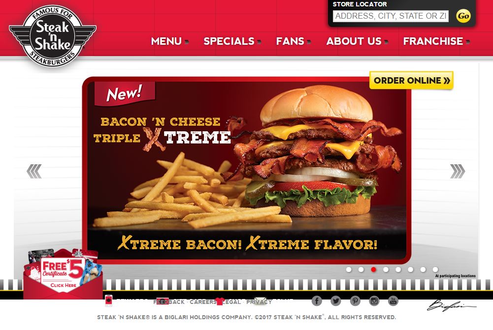
There’s something to be said for a long, scrollable, one-page website. It can work well on the ubiquitous mobile phones and tablets.
But equally as well suited to these devices is the one-page site with no scrolling. Take Steak ‘n Shake’s website, for example. What you see above is what you get.
The middle section does change to highlight current specials, but there’s no need to scroll up or down to find the information you need. All the navigation is right there at the top and each of these choices leads to another one-page display.
It’s simple, easy to navigate, and is suited for both small mobile devices and large desktop computers. Don’t think your website has to be fancy and complicated to make a statement. Sometimes simple is more.
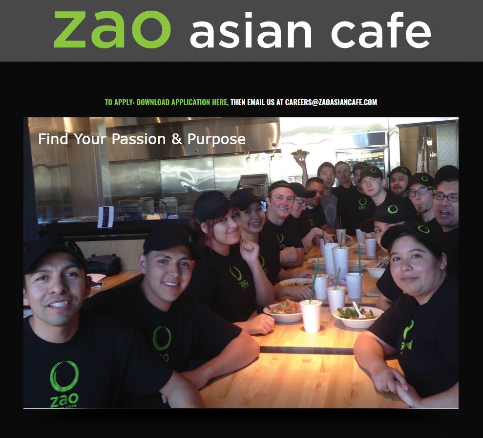
More than just your customers will visit your website. Potential employees will visit it too. That’s why it’s so important to include a careers section so these unique visitors can get in touch.
Zao Asian Cafe does a great job of making their career section stand out by including a picture of some happy employees. They also make it easy to apply with the simple instructions at the top of the page.
Take a note from Zao’s playbook and bring potential employees to you with a simple and effective career section.
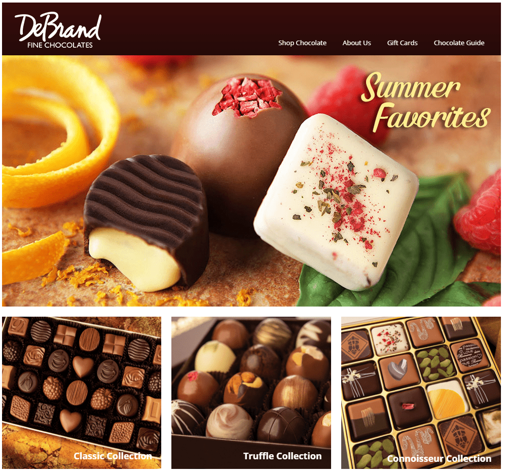
As restaurant websites go, DeBrands Fine Chocolate is at the top of the list.
The simple home page is augmented by high-quality photos of delectable treats that make you want to skip lunch and head straight for the nearest location.
Even better, you can learn about chocolate and the history of the company, request a catalog or view it online, and order your favorite chocolate creations and have them delivered right to your door — all from this beautifully designed website.
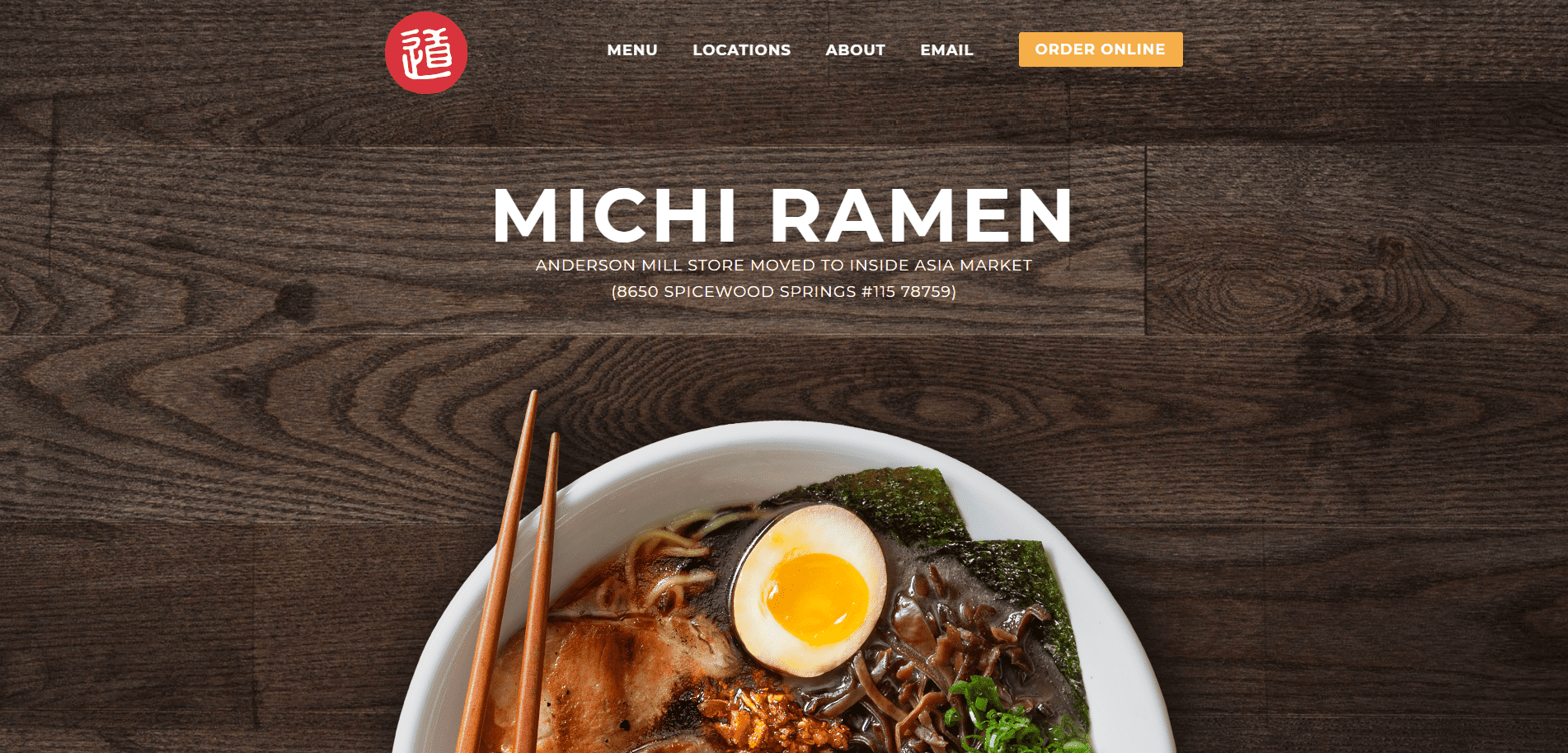
The very first glimpse of Michi Ramen’s page sets our mouths to watering — which is exactly what the best restaurant websites should do.
Even if we’d just eaten, we’d be thinking about our next meal thanks to the beautiful photos and a super simple website design.
The menu appears right on the front page — no searching necessary — and includes all the delicious ingredients that go into making these delectable dishes so great.
We also love the way this restaurant website provides instructions on how to order the right ramen for any occasion. In just three steps, you can create the ramen of your dreams and their expert chefs will cook it up right.
That’s a call to action (CTA) that all restaurant websites can learn from.
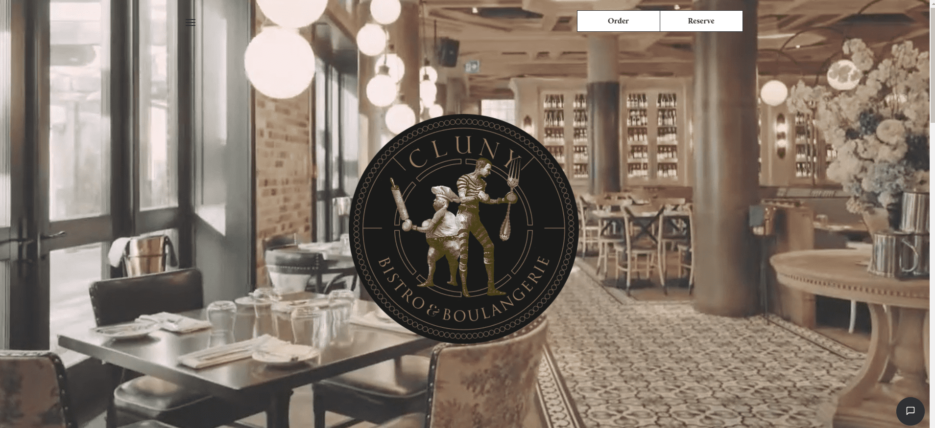
Want to see video done right on a restaurant website? Click on over to Cluny Bistro & Boulangerie.
The homepage is nothing but their logo and video snippets of their beautifully designed interior. Scroll down and you can view their menu, find their hours and location, and learn about private dining and event reservations. All while surrounded by high-quality images of food and facilities.
It’s as simple — and as effective — as that.
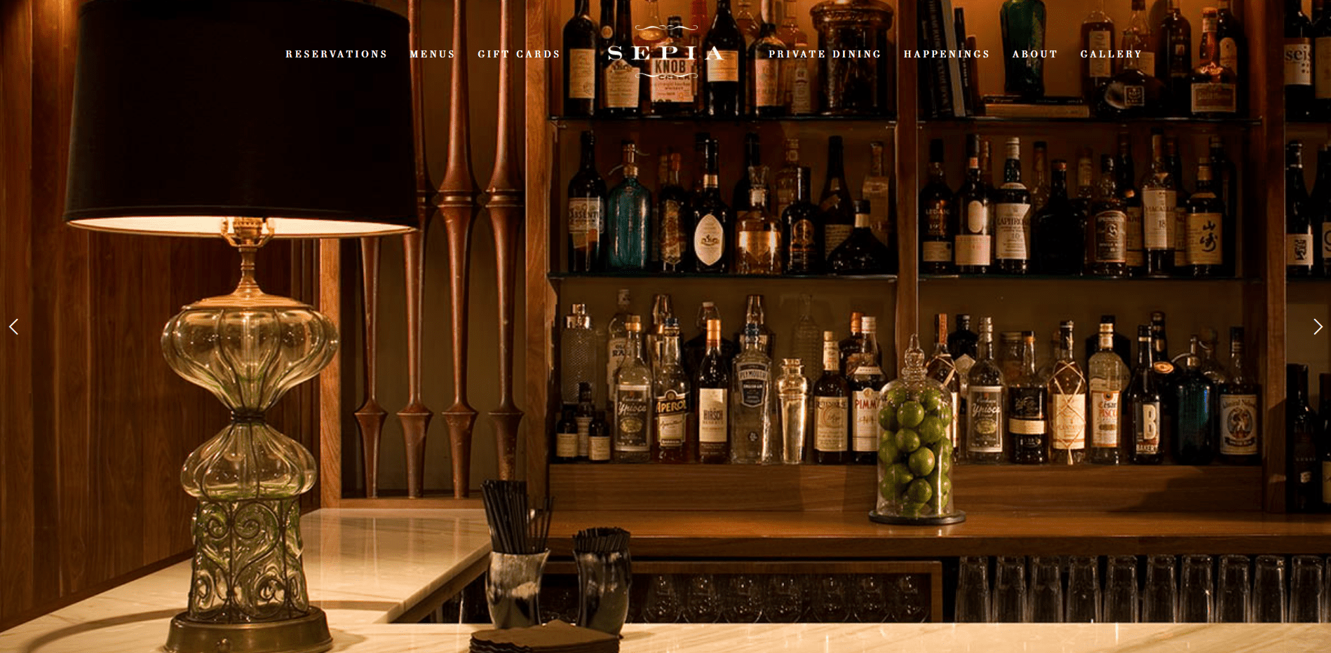
Sepia’s use of full-screen images — of both their food and their facilities — immerses visitors in the customer experience and makes you want to drop everything and head there for your next meal.
Scroll down and the homepage is little more than a bit of text and their hours and location. All the navigation choices are artfully ensconced at the top of the page, where they don’t distract from the beautiful scrolling images.
Elegant and simple all rolled into one. All restaurant websites can learn a thing or two from this online presence.

Hiring a restaurant website manager can take a lot of the burden off the other managers in your restaurant (e.g., FOH/BOH managers) and give them more time to focus on optimizing the day-to-day operations of the business.
Even if you can’t hire a full-time website manager, consider redistributing responsibilities so that an existing manager can, for example, work part-time on vendor management or inventory and part-time on making the website look its best.
Another possible alternative is to take advantage of the gig economy and hire a freelancer to spend a few hours a day managing and updating your online presence.
If photos are good for restaurant websites, videos are better.
Incorporating video into your posts may take a bit more effort, but the interactivity and exposure that type of content will generate is leaps and bounds above simple text and images.
That’s not to say you should do away with images completely and rely solely on video.
In many ways, high-quality images are still the bread and butter of any restaurant website, but more and more people are choosing to share content that contains video over content that contains only images.
Video is the ideal way to do such things as:
Once you start using video, you’ll find even more new and engaging ways to incorporate it into everything you do.
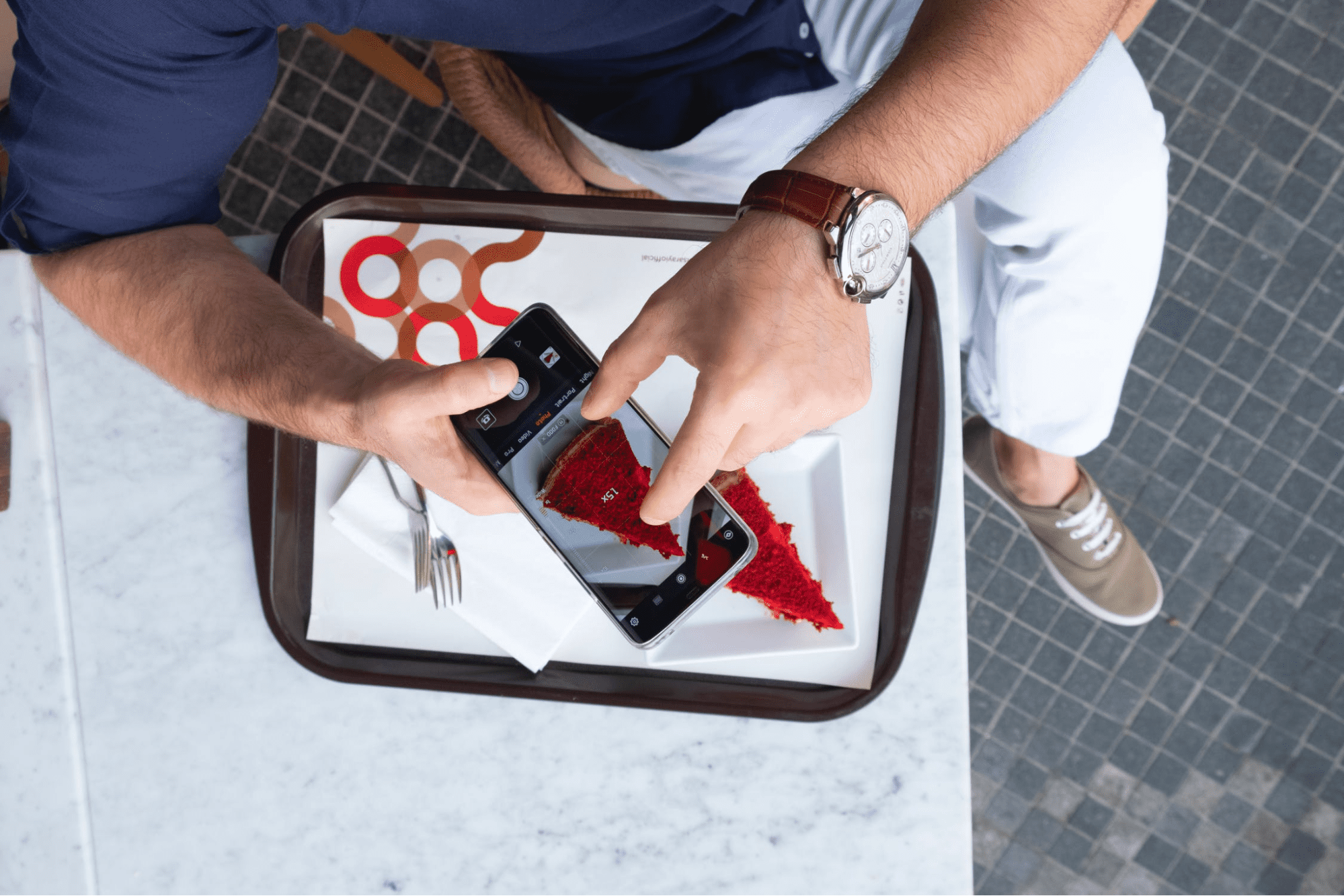
The visual appearance of your website is everything. To that end, always post the most professional-looking photos possible.
And it doesn’t take keeping a professional photographer on the payroll to get those Insta-worthy shots. Invest in a high-quality, high-resolution camera and some good lighting, and you’ll be able to DIY a professional-looking photoshoot at a moment’s notice.
With your own equipment, you’ll be ready for those last-minute or quick-turnaround restaurant website posts that highlight the beautiful dishes your chef makes or the party vibe that developed the night before.
Updating your restaurant website at the right time is one thing that many managers never think about. They’ll just update whenever they have the time in the hopes that it reaches the intended audience.
But if you want to highlight your lunch specials, would you post pictures and videos at 10 p.m.?
Sure, you may be giving your audience time to plan, but there is such a thing as too much lead time. Your customers are busy and are likely to forget if you post things 14 hours before they happen.
Find the optimal time to post — and know when your customer base is most active online — and your website will have a higher chance of success.
People will talk about your restaurant online. They’ll rave about it. They’ll review it. They’ll critique it. They’ll even criticize it from time to time.
You want that feedback, but you also want to curate the best reputation possible.
With that goal in mind, provide a space on your restaurant website for your customers to post reviews and comments about your business. It may not be the only place they comment, but at least you’ll be able to see it right away.
Once comments have been posted on your website, take the time to respond to as many reviews as possible.
For example, thank the reviewer for eating at your establishment and for the nice things they said. And especially address those with negative reviews and find out what you can do to improve.
This very public interaction between you and your customers will help build your restaurant’s reputation as a quality place to eat and as a business that is concerned about the feelings of those who eat there.
Restaurant websites are all about the outward-facing portion of your business. But that doesn’t mean that you can neglect the rest of the customer experience.
Enhance your website — and take it to the next level — by ensuring that your team provides the best service possible to new and returning customers alike.
Good service is the cornerstone of the customer experience and every successful restaurant has it in spades.
A major component of good service is scheduling the right mix of employees throughout the day.
For example, schedule your most efficient team members during lunch when time is at a premium, and schedule your most personable team members during dinner when customers have more time and are more likely to linger.
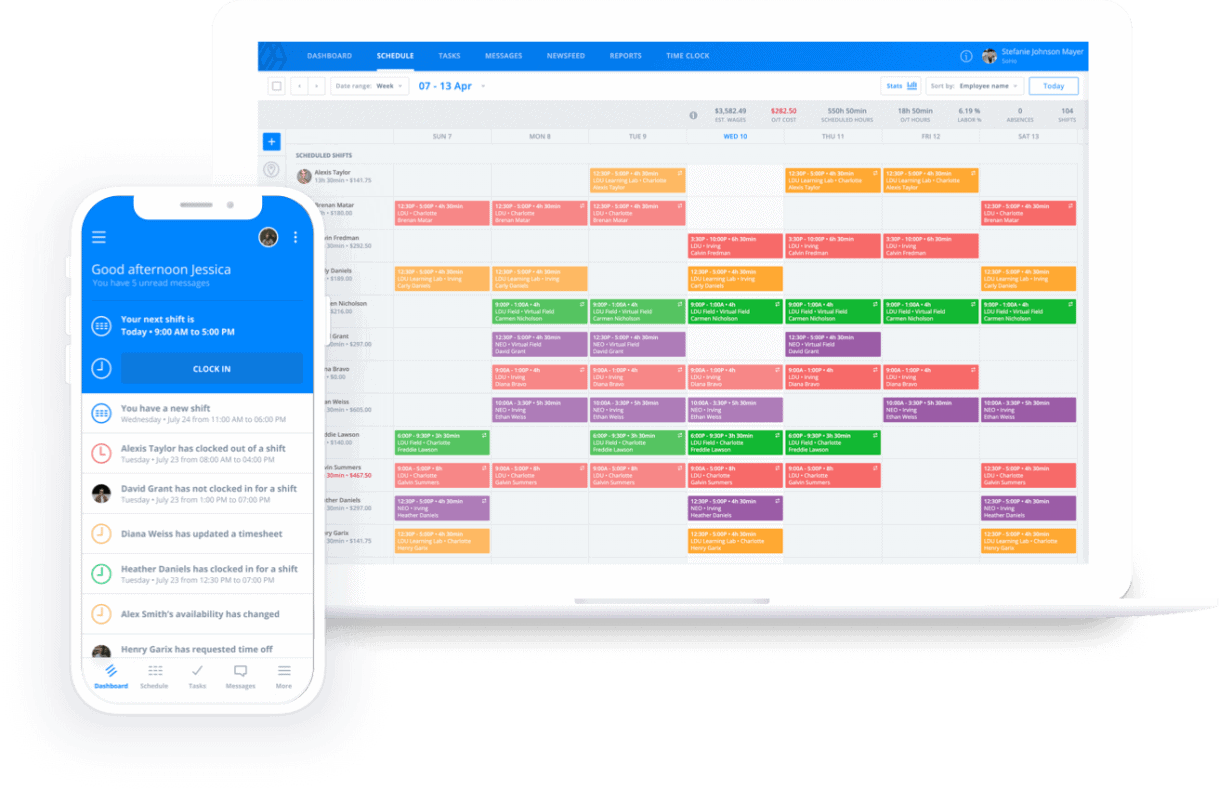
If that sounds like an impossible task, rest assured that it’s not. The Sling scheduling app makes creating even the most complicated staff rotas a breeze.
Whether you have one employee, 10 employees, or 100 employees, Sling’s artificial intelligence helps you assemble just the right team for each shift at your restaurant.
Sling also includes many other features, including:
With Sling, you can schedule faster, communicate better, and organize and manage your workforce from a single, integrated platform.
And when you use Sling for all of your scheduling needs, you’ll have more time to focus on bringing your restaurant websites to life and making them shine.
For more free resources to help you manage your business better, organize and schedule your team, and track and calculate labor costs, visit GetSling.com today.
See Here For Last Updated Dates: Link
This content is for informational purposes and is not intended as legal, tax, HR, or any other professional advice. Please contact an attorney or other professional for specific advice.
Schedule faster, communicate better, get things done.